
“Design is not just what it looks like and feels like. Design is how it works.” ~ Steve Jobs


But, what correlation does design have to making a customer buy?
Think of how our shopping behavior has changed over the years. Shopping carts that we used to drag along the shop floors is now a tiny icon. There are very few brick & mortar shops compared to digital ones. In fact, there are multiple online stores for fashion, gadgets, books, medicines, cakes, and what not per person. eMarketer estimates the eCommerce industry to be $4 Trillion huge by 2020.
Now, if you want to take a small share of this massive market, you need to get the fit and finish your online store (read: design) perfect. Like Steve Jobs said, it is not how it looks, but how it (the store) works that makes a difference.
Table of Contents
eCommerce UI Mistakes that shoo away Customers
To get a real feel of how customers feel when they go shopping online, we ourselves logged into a randomly selected 25 online stores and did a mockup shopping spree. We loved some website which followed the ecommerce website design best practices while some others were a pain to wade through.
Here are some eCommerce UI mistakes that stared back at us that ruined the shopping experience.
A cluttered home page with flashy banners
No search bar
A shopping cart flow that was complicated
No detailed product info (especially size chart!)
Poorly designed product showcase
Lengthy checkout process that takes forever
Well, there are still more that can be added to this list. But, turns out it is not the mistakes, but the lack of knowledge of best practices that prevents online stores from getting maximizing their conversions.
So, to iron out the difficult for new online business owners and for existing ones, we decided to compile this list of eCommerce design best practices. In the long run, these design best practices for ecommerce websites will earn your store increased time spent on site and also lead to more conversions.
Begin with the Home Page
The home page is the first digital space where your customer lands from a search result or by clicking on an ad. Consider it to be the lobby area where you will welcome your customers if it had been an offline store.
Hence, keeping your home page inviting goes without saying. If you are not sure how to do it, here are some ecommerce website best practices that will help turn your homepage into a conversion magnet:
1.Search box omnipresent at the top

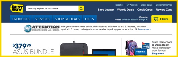
2. A neatly organized and quick to spot navigation bar


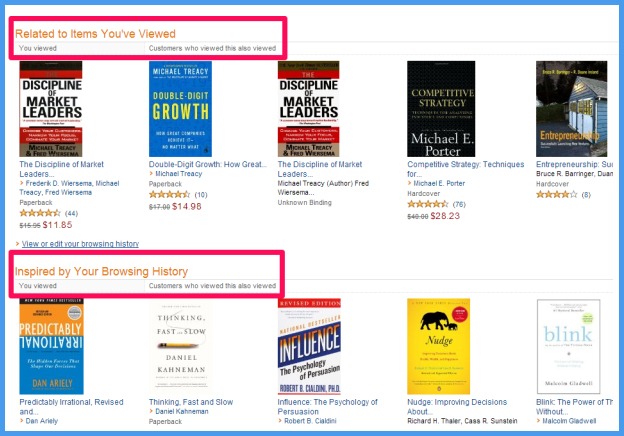
3. User browsing history inspired product suggestions

4. Deals section with current and oncoming offers

Craft the Product Page for Maximum Selling
The product page is the next phase in the buyer’s journey. It is here that the desire to buy something actually escalates and turns into an actual purchase.
Here are some best practice for an ecommerce site for product display:
How to show your products the best?
Have images for every color with zoom in and zoom out functionality
Provide multiple-anged images that show the product inside-out
Show products in outdoor lighting or in actual use
Incorporate product videos whenever possible
Use whitespace to show the contrast of the image
Why all this trouble? A well-shown product is sold 3x better than a product with poor quality or NO images at all.
How to fan the spark of customer’s interest?
Customer reviews and ratings from previous buyers
Sold count or product ranking in category
Social sharing buttons
Add to wishlist
These tactics help fan a simple interest in a product into a buying desire that ultimately results in conversion.
Shopping Cart Optimization
Believe it or not, it is the shopping cart which plays villain to most online store. More than 67% of the sales is lost at the shopping cart. It is commonly referred to as shopping cart abandonment.
Although it is impossible to have zero cart abandonment in an eCommerce environment, it is always possible to take steps to negate its possibility.
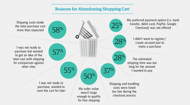
To negate cart abandonment, you need to know the various reasons that lead to abandonment.
The top reasons why customers abandon their carts can be deduced from below:

How can you fix these issues that chase away customers?
These ecommerce website best practices will help overcome the common reasons why customers fail to pay up.
Disclose shipping costs in the product page. Don’t spring a nasty surprise when it is time to pay up
Show customers that you are a trustworthy store with trust seals and security badges from SSL certificate vendors or security agencies
Give customers the option to check out using guest accounts. Mandatory account creation is a huge turn-off
Be transparent about shipping time. Even if it is going to be late, be open and inform your customers
Provide multiple payment options. Digital wallets, online banking, debit/credit cards, loyalty points, etc.
Summing it Up
Home page, product page and the checkout page is where the core activity of conversion happens. While home page kindles inspiration, product page further fans the desire to make a purchase. The checkout page culminates it by setting the stage for the customer to make the payment and finish the transaction.
While all this might seem like working smooth like butter, each phase is a difficult hurdle to overcome for the eCommerce website owner. The hurdle is designing these pages for maximum conversion, we have pointed out above how design pitfalls and the best practice one can embrace to create a ecommerce website design that can make your online store a magnet to lure customers.
Although the Internet has a wealth of free design templates and eCommerce mockups, the truth is there is nothing which comes close to finishing like a custom eCommerce design. Partner with a professional eCommerce website designing company to give your online store a total rejig from bottoms up rendering an upscale use experience that will seduce customers to visit the store again and again.


Glad to hear that tweaking the info on your e-commerce site helped reduce abandonment.